Mat is a mobile app that helps people who want to practice yoga find the teachers or studios that are a good fit for them
Personal project
Concept
UX
UI
User Research
Prototyping
Branding
I decided to become a Yogi!  (spoiler alert: Is wasn’t easy)
Three years ago, as a true couch potato I decided it’s about time I start being active. I decided to practice yoga.
Finding a place to practice was more difficult than I expected. I looked for information online, and found partial information about prices, schedules, teachers, or types of yoga… I turned to Facebook groups and friends for recommendations, but the information there was also confusing…
I found myself abandoning the search again and again.
The problem:
Finding a place to practice yoga and sustain a healthy, stress-free lifestyle.
The solution:
Creating a platform that will connect people who want to practice yoga with the teachers or studios that are a good fit for them, so they can persist practicing yoga, live a healthier, stress-free life and avoid illnesses caused by pressure.
Research
Market Analysis
Before diving in, I conducted a thorough market analysis to make sure that I haven’t missed any existing solution to this problem.
I found two platforms featuring an easy and intuitive search, booking, and payment for fitness classes, including yoga (ClassPass and Mindbody). However, those platforms were not yoga-oriented. They didn’t offer needed information regarding teachers or genre. I found a third platform that was dedicated to the yoga world, but it lacked booking or payment features (YogaTrail).
Online Survey
49 people answered an online survey and helped me understand better the main pain points of yoga practitioners when it comes to finding a place to practice yoga.Survey Results
User Persona
Based on the survey, mostly based on the hyper engaged responders, I developed a user persona to refer to in the process: Lauren Hobbs.Jobs to Be Done (JTBD)
To understand what does Lauren wants to achieve and way, I used the JTBD methodology.
key insight: Lauren has a lot of pressure and stress managing her own business. She is looking to improve her quality of life and reduce stress by engaging in physical activity to give her some balance – both mentally and physically.

Existing User journey map
key insight: the main problem that makes Lauren abandon the search appears when she comes across partial information.
This is Lauren’s journey:
"This routine is exhausting"
"I'll go back to practicing yoga!"
Google, Google on the wall...
"OMG. This is too much!"
"I'll come back to it later"
"OK, maybe I'll try to call them"
"Where can I find the schedule?"
"Let's give it a chance"
"I need to go back on the search"
"Why can't I find a place to practice yoga?"
"I give up..."
Prospective User Journey Map – Using The App
I used the UJM model again, but now with the product in mind. How would Lauren’s experience be different with the product?
I decided I wanted to make a mobile platform that Lauren could use on the go.
Meet
Mat.
Your yoga consultant
 I also designed Mat's logo ✍️
Mat is here to help you find all the information you need to practice yoga and keep a healthy, active and calm lifestyle.
Spend less time searching and more time on the yoga mat.
Design & prototype
Onboarding flow
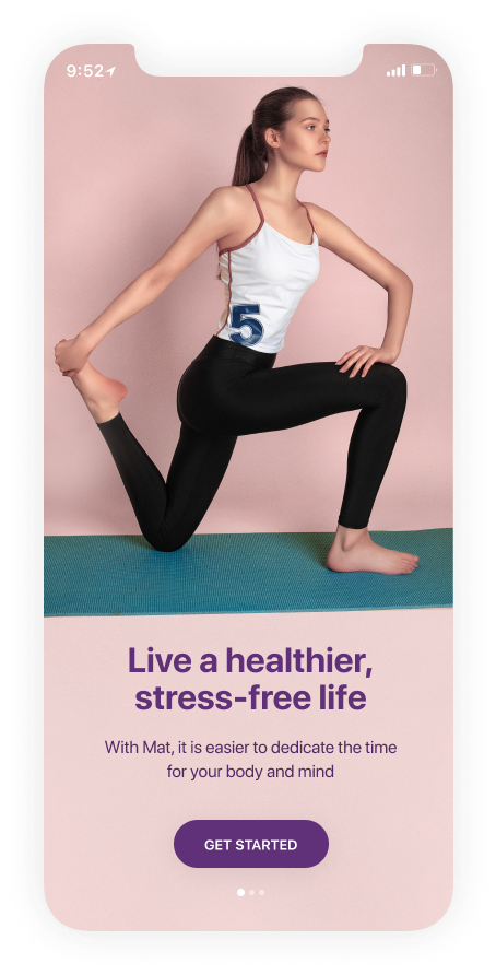


Get started in 3 simple steps
Apart from the sign-up process, I chose to address two brief issues that could help Mat personalize the content for the user.
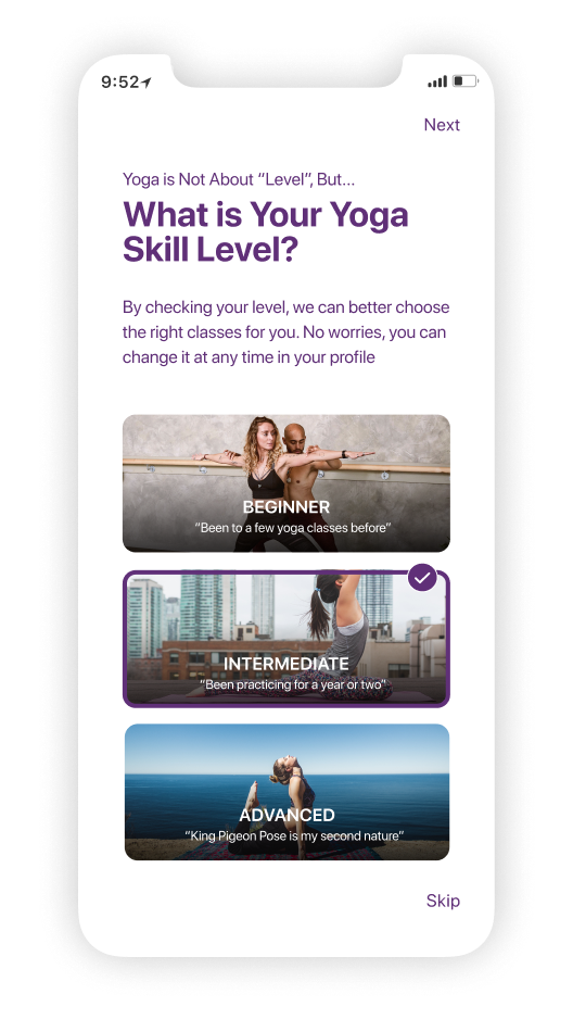
No worries – this can be changed at any time in the user’s profile.
1. Sign up
Sign up using your mail, Facebook or Google account
2. Yoga skill level
Help Mat personalize the content just for your yoga skill level.
3. Location access
We will use your location to adjust the yoga activities offered to you by your current location.
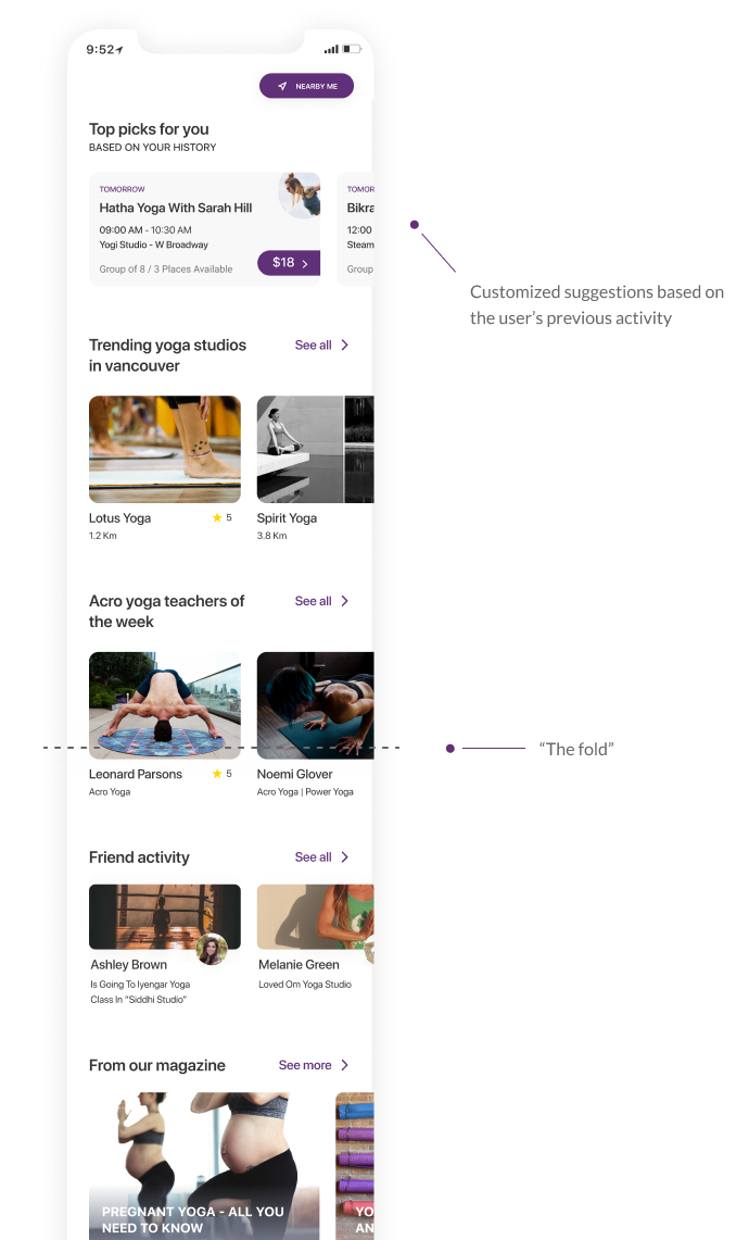
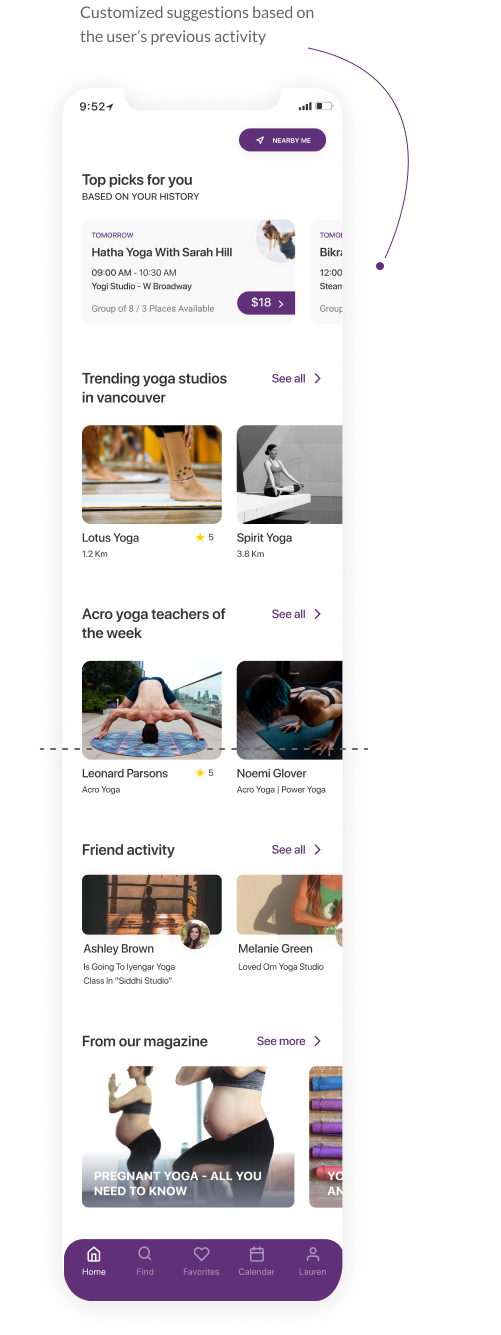
Exploration experience at the home screen
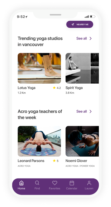
Tailored offers for the user and exploration of the yoga opportunities nearby. The user can also stay up to date with friends’ activities in the yoga world and read articles in the yoga magazine that contains tips and recommendations.
First use

Coming back for more yoga
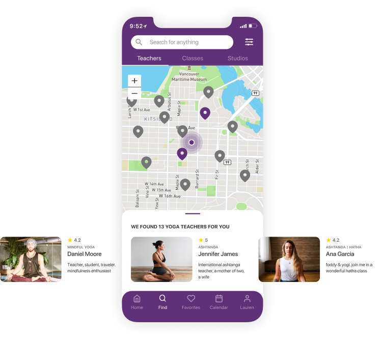
Find and filter the best yoga experience for you
A location-based search for a yoga teacher, class, or studio is one of the features Mat offers. The results can be modified using the search bar or the filters.
The screen can be divided between the search results and the map view.
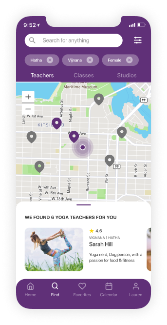
Modify the results using the filters
- Yoga genre
- Type of class (Group or private)
- Difficulty level
- Teacher's gender
- Class date
- Class price
- Time of day
- Distance from current location

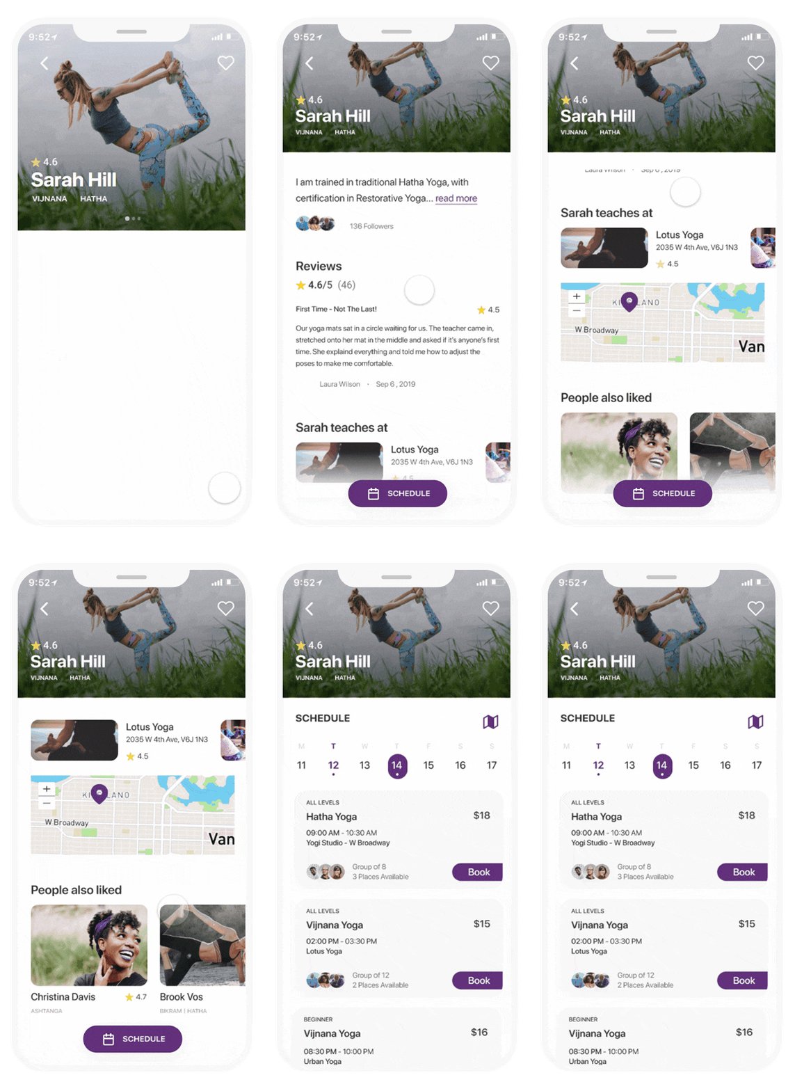
Teacher’s profile page & schedule
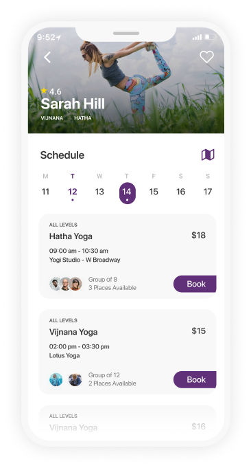
Will Sarah be a good fit for the user? Her profile page may be the place to look to get an answer to that question and address this significant pain point of finding the right teacher for the user.
If she is the one, the floating “Schedule” button is the next place to go to.

Teacher’s schedule List view

Teacher’s schedule Map view

Booking & payment via Mat Credit
Mat allows the user to book and pay for the lesson through the app. The user is not obliged to subscribe to a particular studio and can attend various yoga classes in his or her area or even elsewhere, like when on vacations or business trips.
Foe every payments made through the app, the user gets 5% extra credit to thier “Mat credit” and can be used in the next purchase.
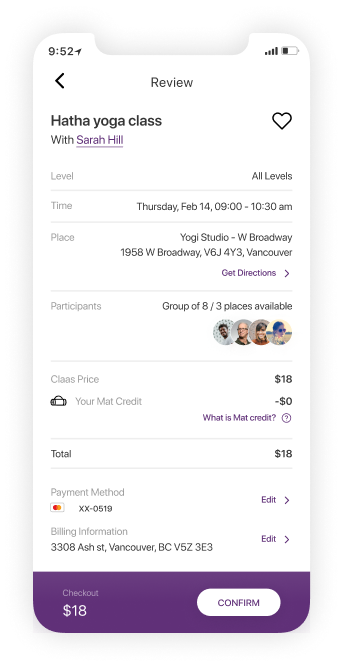
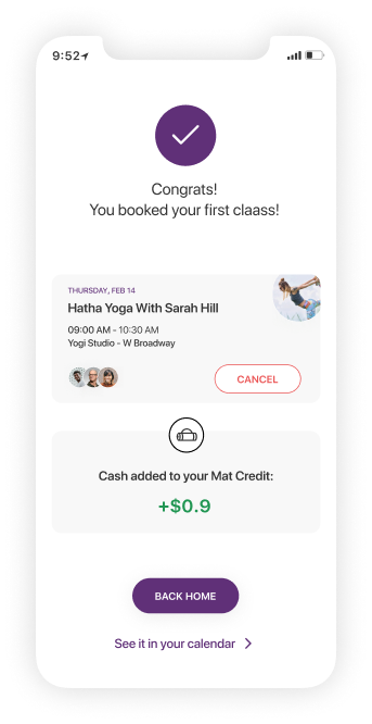
Payment & booking flow

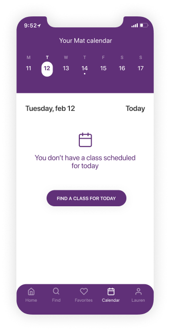
The user’s yoga calendar is accessible via the bottom navigation
In the calendar section, the user can see upcoming classes and manage his or her bookings.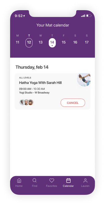
Notification
Congratulations! The user booked a class via Mat. Notifications will make sure he or she won’t forget about the class, and will also come up 30 minutes after the class is finished with a request to leave a review to hear how it was.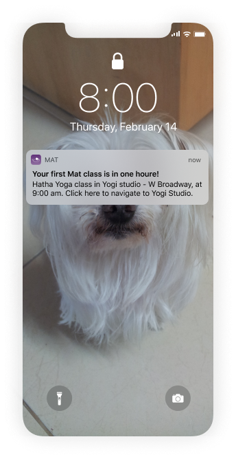

Profile
This section of the app is the place where the user can access their Mat credit, change their yoga skill level and keep track of the yoga they have been doing via the journal.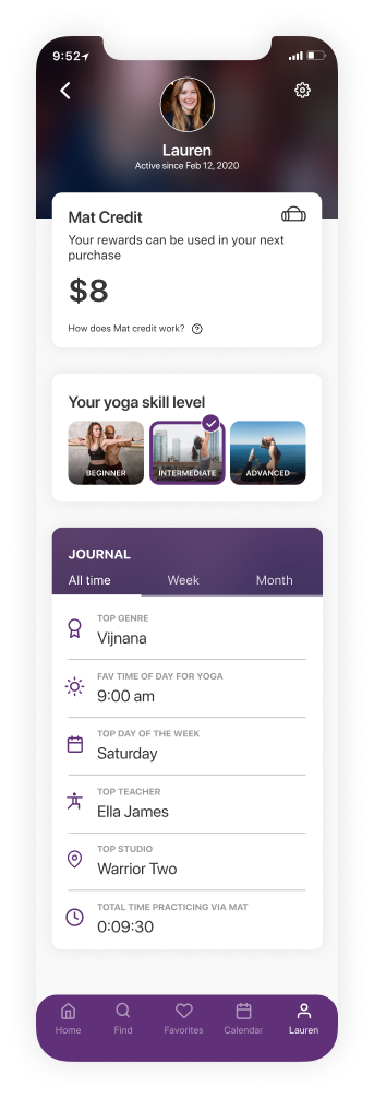
What's next?
Usability Testing
The next step in this project is conducting usability testing to refine and validate the solution.
Web Platform
In order to give the user a complete experience, I would like to design a web platform. As recent studies show, mobile usage is in a constant growth. With that said, in 2018, 42% of web visits in the U.S were made from a desktop, and the total time users spent on sites when using desktop devices was still larger than the total time for mobile (58% via desktop). Mat’s users can find it useful to access the platform via desktop, especially for teacher or lesson searches.
Yoga Retreats
Yoga retreats are a withdrawal from the daily routine to instead focus on the practice of yoga. Usually, it includes a stay at a peaceful and calm place or resort offering yoga activities for a few days.
It is worth considering offer information about and booking for yoga retreats via Mat to users. This requires further research into the scope of our users who may use it.
Final thoughts
Yoga has become increasingly popular in the Western world, mostly as a physical health practice, but also for stress reduction and general wellness. Finding a place to practice yoga can be an easy and friendly process. Moreover, It was important to me to not end the process there, but also to meet the need to book the class and pay for it without being tied to a particular studio.
When working on this project, I had multiple directions. The constant feedback I got was very important, helped me understand which direction is better to take regarding this project and of course deeply affected the end result.
In addition, I had the opportunity to try out the prototyping tool – ProtoPie, which was great and allowed me to articulate and present my design and micro-interactions.
Take a look at the next one


 (spoiler alert: Is wasn’t easy)

