Personal project
Concept
UX
UI
Market Analysis
Prototyping
Time is our most valuable asset!
It’s really shocking to see how much time people spend on actually managing their time. People are using countless lists of things they want to do – whether for professional or personal tasks, while also managing their calendars It may cause a lack of focus or just be “too much” for some people.
As part of the advanced UX/UI course, I was asked to create a calendar mobile app. I created a calendar & tasker app named Schedule. This app was designed to help users manage their calendars as well as their tasks, all in one place. The app’s target market is people working on personal or professional projects alone or in small teams.
Schedule app is designed for Android and displayed on the Google Pixel 3XL device.
The Problem:
Managing events, tasks, and lists in multiple apps.The Solution:
Creating an app that will manage the agenda in a way that combines task management with calendar management. This will enable the user to manage time effectively with all information in one place and with an option to share it with friends or partners.Make your time count
Research
Market Analysis
A market analysis is the first step in order to find out if there are products in the market that currently solve the problem.My conclusion from this analysis:
There are a lot of excellent applications that serve one of the needs: calendar management or task management. Every tool I came across is more oriented to one of these fields or doesn’t offer the flexibility I wanted to provide in Schedule.
There are three main categories in the calendar / tasks market:
1. Calendar apps, such as Google, Apple calendar and Microsoft Outlook Calendars. They are calendar-oriented popular tools featuring calendar management, sharing options, and alerts.
2. Tasks apps – A large variety of tools like Todoist, Trello, Microsoft To-Do, and Handle. These applications offer task management tools for individuals; a few of them offer tools for teams as well. These apps are tasks-oriented. Some of them integrate into third-party calendar applications, as Google calendar, via a third-party application (for example, iCal feed method, which integrates approximately once per day, and Zapier).
3. Collaboration in the workplace apps – The third category is slightly different. This kind of product offers work team collaboration & team management tools like Monday, Jira, Asana. These products are specifically tailored to the business world.The solution - key features
Shared Tasks & Boards
Calendar & Task Management in a Single Place
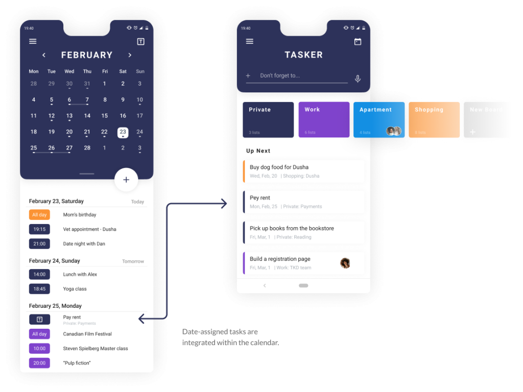
Tasks also take time. The user will be able to see date-assigned tasks integrated within the calendar.
Visualization of Time
The user can take a look at the agenda in at-a-glance or in-depth.
Calendar-oriented or task-oriented approach
Schedule is split into two main areas: the calendar and the tasker. Some users are more calendar-oriented, some of them are more tasks-oriented. It was important for me to let the user decide what to put in the front as the app’s home screen – the calendar or the tasker.
Also, I wanted to create two separate areas, but with integrated content.
1
The Tasker
Boards Divided by Topics Alongside a List Regarding the Near Future
A pillar feature in Schedule is the tasker. This app is designed to help the users manage their tasks as well as their calendar, all in one place.
The Tasker is the place to manage every to-do list, assignment and goal. All data is linked to the calendar and will appear next to the events of the day.
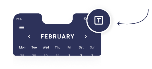
The task manager is accessible from any screen on the app via the “T” icon.
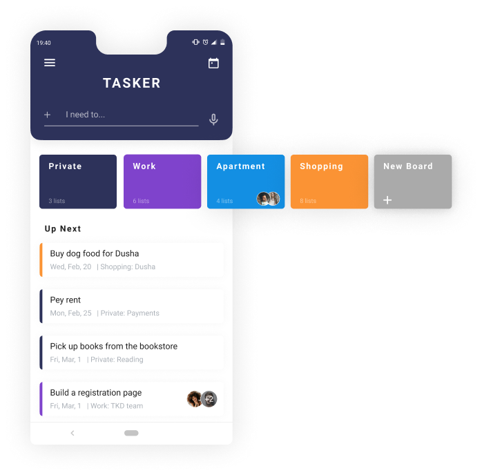
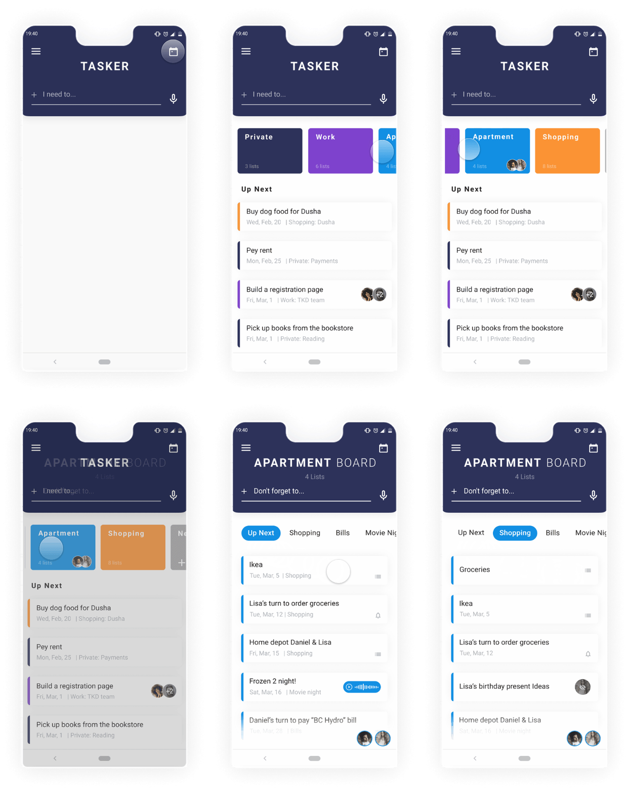
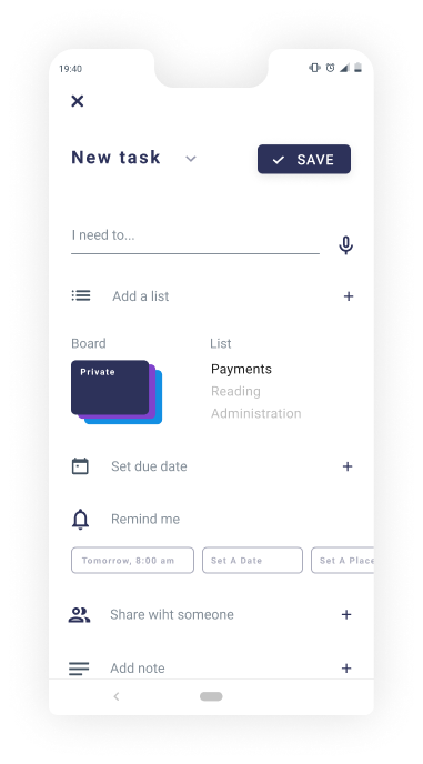
- New tasks can be added using the text input or voice recorder.
- Different boards for different topics. Each board contains several lists. Boards or lists can be shared for collaboration with other users.
- Tasks from any board that are due soon appear at the bottom of the page at the “Up Next” section.
Board, List & Task Architecture
A board is dedicated to a specific topic: for example, the apartment. The board contains one or more lists, and every list is dedicated to a specific sub-topic, like shopping or bills. Every list contains one or more relevant tasks.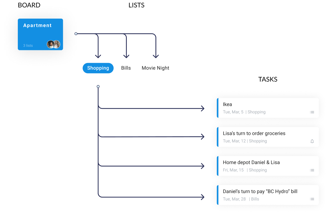
Into the Apartment Board
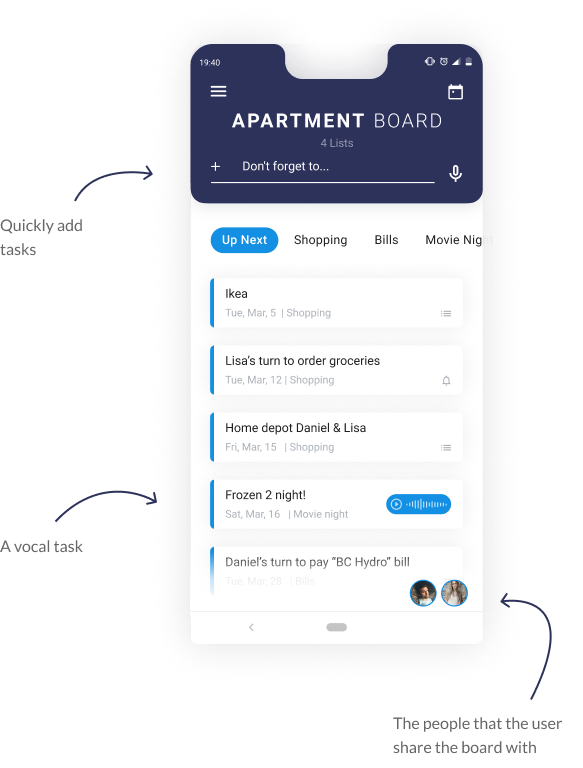
The apartment board is shared with the user’s roommates. They share four lists: Shopping, Bills, Movie Night, and Flat Party Plans. The “Up Next” section contains all the tasks that are due soon.
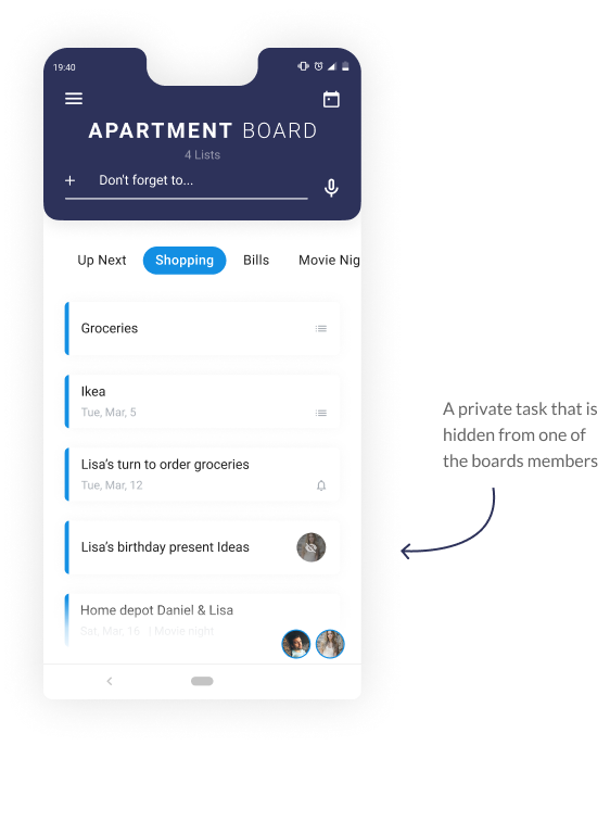
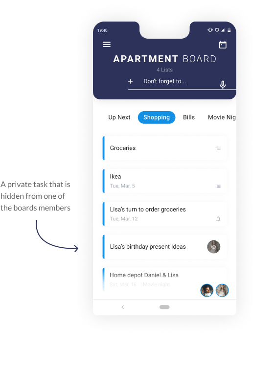
Tasks are displayed in a card view, and every task can contain several types of attachments, such as lists, reminders, vocal notes, and file attachments. Some cards within a shared board may be private and hidden from one or more of the board members.
The Calendar
2
Drag Between Monthly-View and a List-View
The calendar’s home screen combines a zoom-out view of the month next to a list view of today’s schedule and tasks.
By dragging the zoom-out view to the top of the screen, the user can see the list view of the days to come.
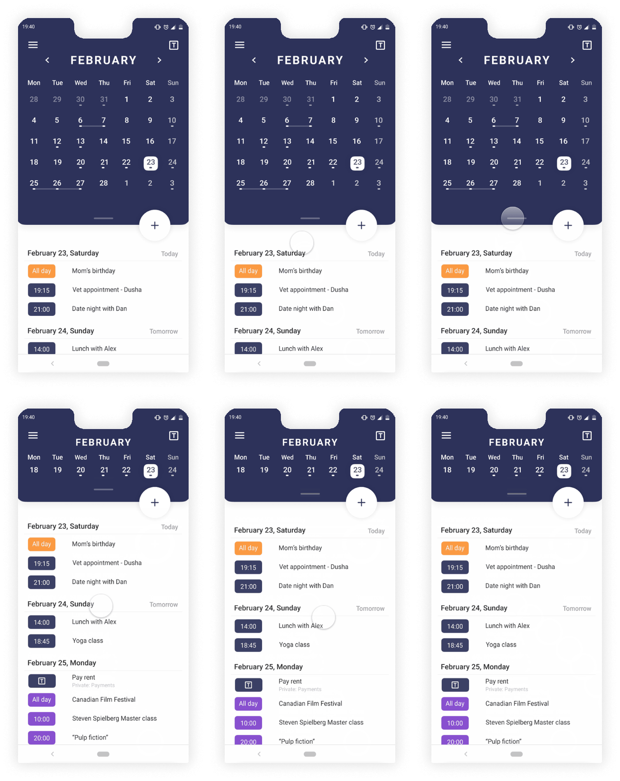
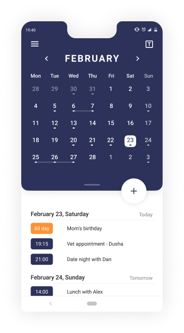
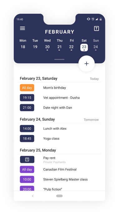
- The “T” icon leads to the task manager (the “Tasker”); it's available on any screen for quick access.
- This week’s zoom-out view remains at the top of the screen to easily navigate between the days of the week. This section also allows scrolling to the next or previous weeks.
- Every color represents a different calendar: work calendar, private calendar, etc.
Different Perspectives
The user can choose to take a deeper look at a specific day and get an idea of the time each event will cover from his or her day.
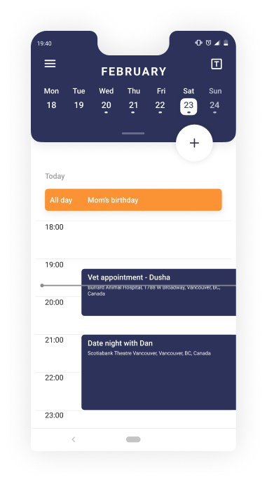
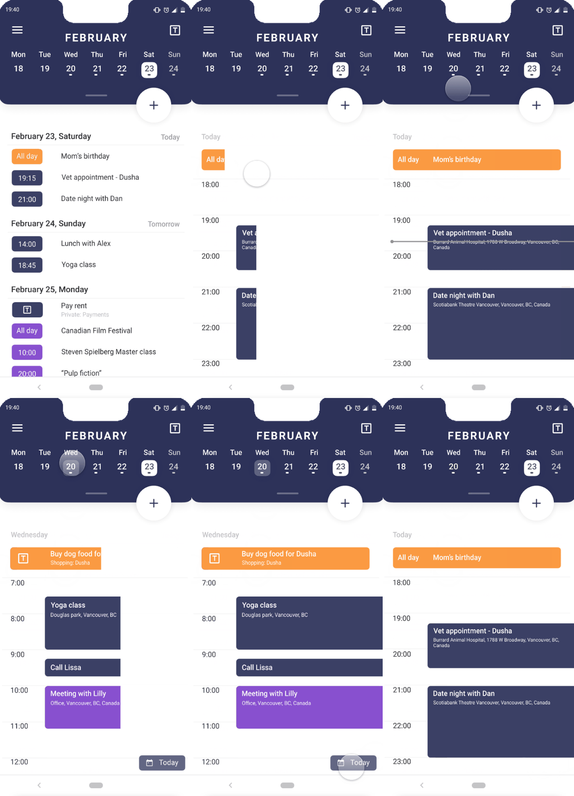
a look at your week
Add a new event/task
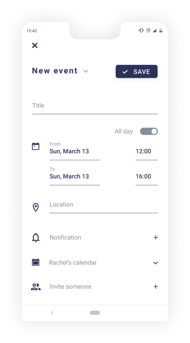
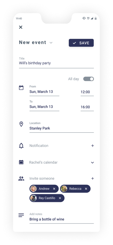
Add a new event or task to your calendar, share it, and attach any important information you might need.


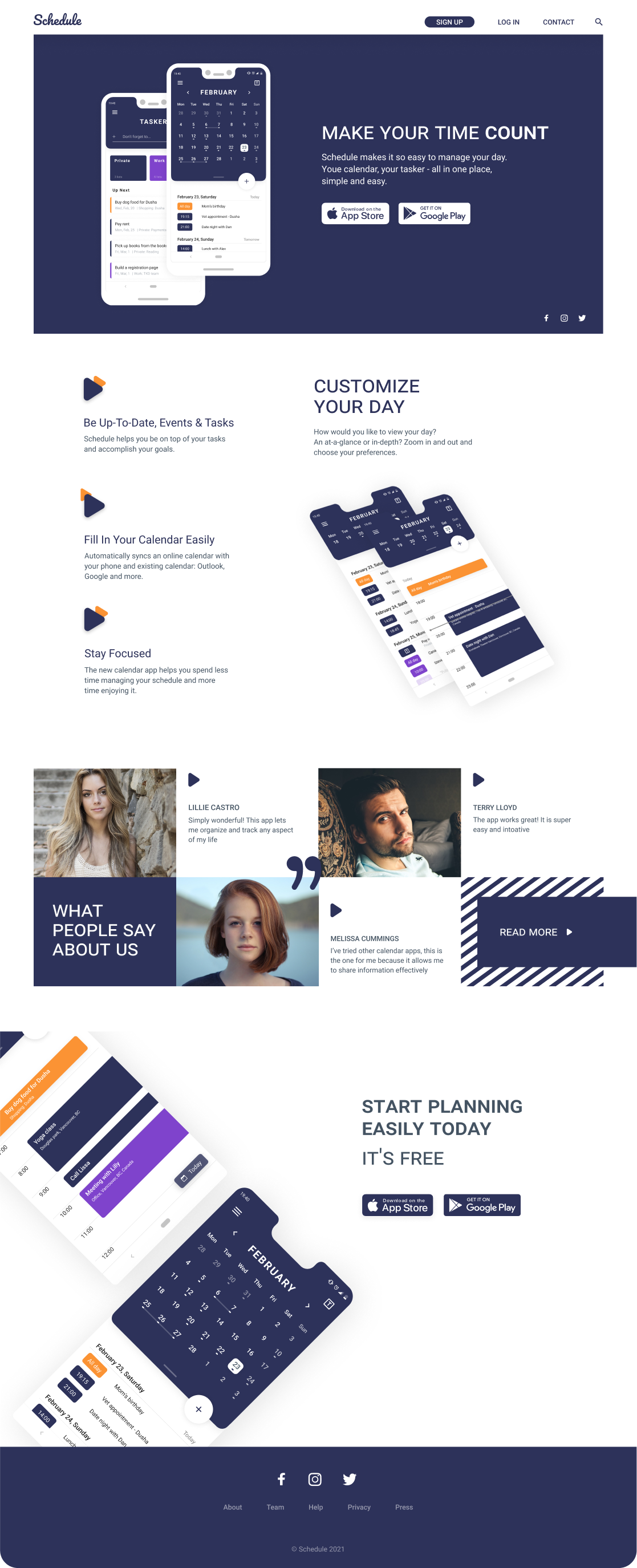
Landing page
Marketing
What's next?
Desktop App
The users can manage their time and tasks on a desktop as well. It will be especially helpful for people who spend a lot of time in the office or use Schedule for professional projects.Final thoughts
The main goal of this project is to help people manage their time and give them a place that combines calendar, tasks and notes together. The app is aimed at people working on personal or professional projects alone or in small teams.
Schedule was a project as part of the advanced UX/UI course. This was the first project in which I used ProtiPie for the micro-interactions and prototype. I loved the way it allowed me to flourish life in the project.
I learned how to look for alternative solutions, conduct a market analysis, and how it is important to keep looking at the current products out there with a diagnostic eye. Furthermore, I learned how to look at the project I created with a critical eye after submitting it, continuing to look for alternatives and changing it according to the feedback I received and the research I continued to do after it was “complete.”


